Company: Yammer
Platform: Windows App
Position: Design Lead
Platform: Windows App
Position: Design Lead
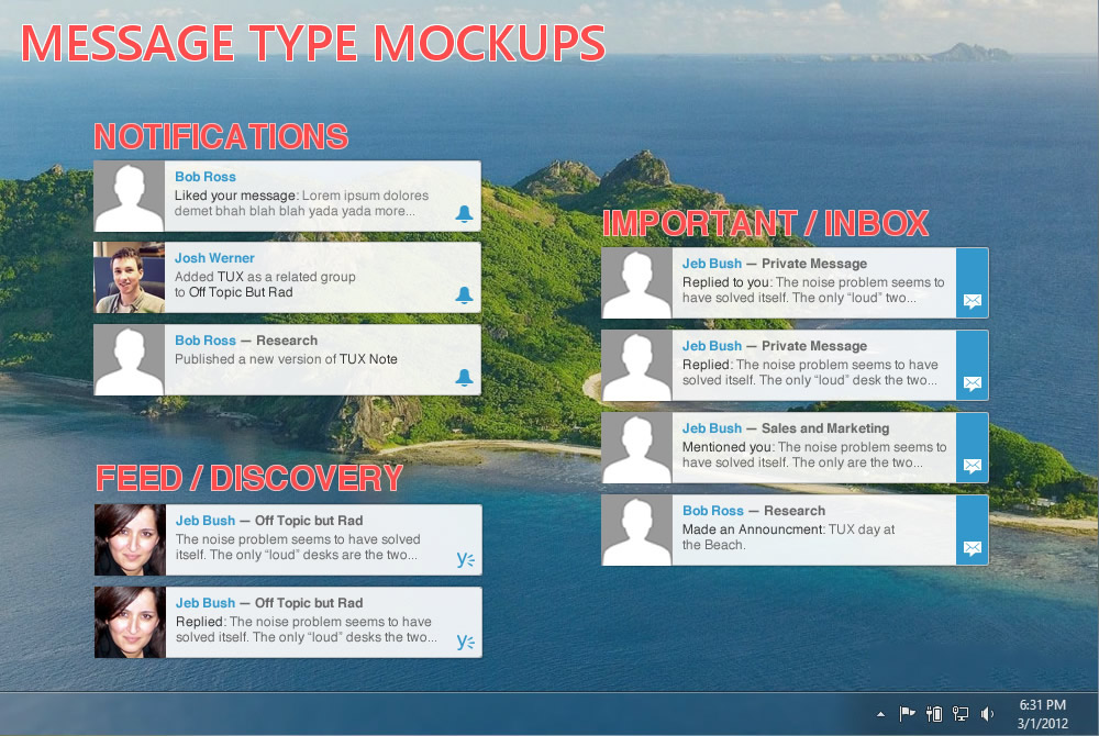
What did you set out to achieve with this design project? To build a lightweight desktop app for Yammer that is both easy to iterate on, and meets our users expectations.
What decisions did you make that helped you achieve that goal? Cutting features. Sticking to a minimum viable experience instead of building out a ton of features helped me avoid scope creep. I shipped the project in less than a month without sacrificing quality.
What challenges did you have / what made it difficult to design this? There was already another desktop app for Yammer. It was ugly, and lacked a lot features that had been built after the app was released. But users loved it, they thought it was perfect. A lot of that love came from the fact that it was their only experience with Yammer. Once they downloaded the app, they never had a reason to visit the website. Designing something that users wanted to switch to, instead of forcing them, was tricky.
If you had the opportunity to go back and make a different design decision, what would you change? Every time a user clicks on a notification, it opens Yammer in a new tab, regardless of whether they had Yammer already open. It would have been costly for the engineering team to fix the problem, so I decided not to spend time on it. In the end it was the right tradeoff for version one, but for the next itteration I would make it a priority to fix that bit of UX.